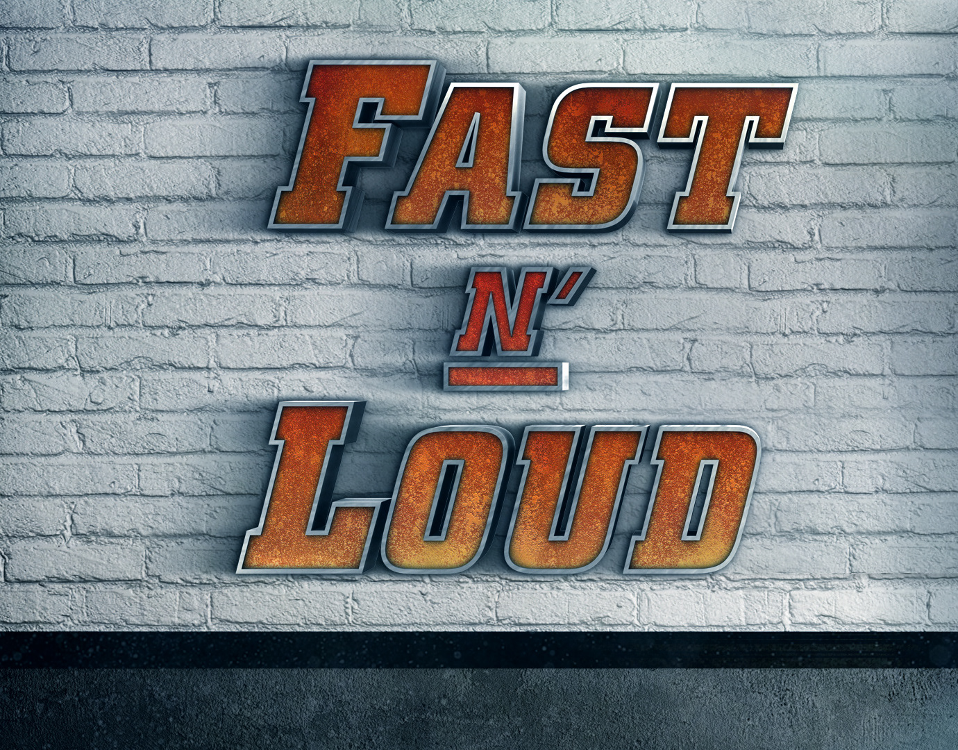
We initially presented three designs. One was designed to look most like their in-game graphics, one was more grunged up and over the top 3D and the third was based on their Summmoners Cup (their champions cup at the tournaments) which is very clean and polished compared to their game graphics. While I was responsible for refining the textures of the first two, I was mostly focused on the third design shown below, which the client responded to the most. We felt it was too light and clean looking, so adjusted the textures and shapes to have more of a hand-tooled feeling.
In the initial and final design I wanted to feature a device that could bring on all of the inserts and also become a logo holder. Below is a motion test of the final device, designed by me and animated by Cake Studios.
